* * HELP & MANUAL PREMIUM PACK 3 DEMO VERSION * *
This documentation was styled with a demo skin from the Premium Pack 3 add-on for Help & Manual. The contents of the skin are encrypted and not configurable.
This version is copyright and may only be used for local testing purposes. It may not be distributed.
Please purchase the full version of the Premium Pack to get the configurable skins and remove this notice.
This is where you can see all Estimates/WIP's/Invoices at once. There are many filters available.
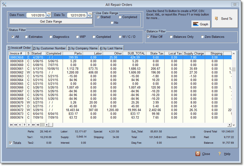
You can think of this screen more like a report. You can use the filters on the top, change the order of the invoices and change the order of the displayed fields, then click on the SendTo Button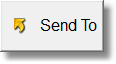 to create a report or spreadsheet or more.
And, just when you thought you'd have to study a bunch of numbers, there is a graph button  . This will change the display to a graph screen.
To get back to the list of invoices, simply click on the list button 
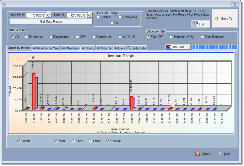
The first graph, Graph by Invoice, shows all RO's between the start or completed dates selected. You can also filter by using the status filter and the balance filter. Be careful when you look at this graph because it ONLY graphs invoices, not zero dates. For instance if you only did one RO per month and used the program for say 2 years, the graph might look pretty good, because the zero dates don't display. This Graph reflects the filters you use above and you don't need the Calculate button.
The rest of the graphs are plotted differently. They include zero dates from your date range, so when you look at the graphs, they are over that period of time, and it will look as you expect if you only do one invoice per month... few ups and many downs.
In order for the rest of the graphs to work, you'll need to click the calculate button  . We don't do that automatically because it may take some time to build if you have been using the program for several years. Every time you change the date range or select a different Status filter, you'll need to re-calculate.
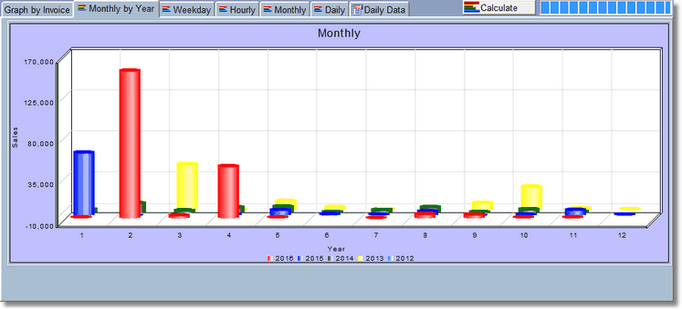
This Graph helps to see trends for the year by the month. You can graph up to 5 years. We use this graph to give us excuses why the business isn't doing so well this month. It also helps to project when you should probably be doing more marketing and/or advertising.
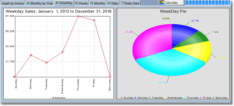
Weekday Graph
The Weekday graph shows you when your sales are happening. There are a lot more factors to consider here, like who is working and if you're closed. The above graph indicates they are probably closed on Saturday and Sunday.
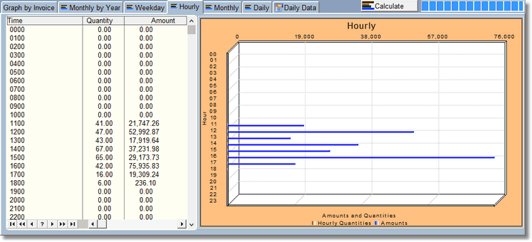
Hourly Graph
With the Hourly Graph, you can see when you are starting most of your transactions. This coincides with the Date Started. As of this writing we don't have a time completed, just a date completed.
Play with this, push some buttons, turn on or off some check marks. You can't hurt anything here. You can right click on the graphs and get different options, including printing the graph out.